In the digital era, an album cover often serves as the first point of contact between an artist and potential listeners. Designing an impactful album cover is crucial; it can enhance the appeal of the music and significantly contribute to cementing the artist’s brand identity. With the shift to digital music, album covers are essential for grabbing attention on streaming platforms and social media, serving as the initial touchpoint between artists and their audience.
Recognizing the Importance of Album Cover Design
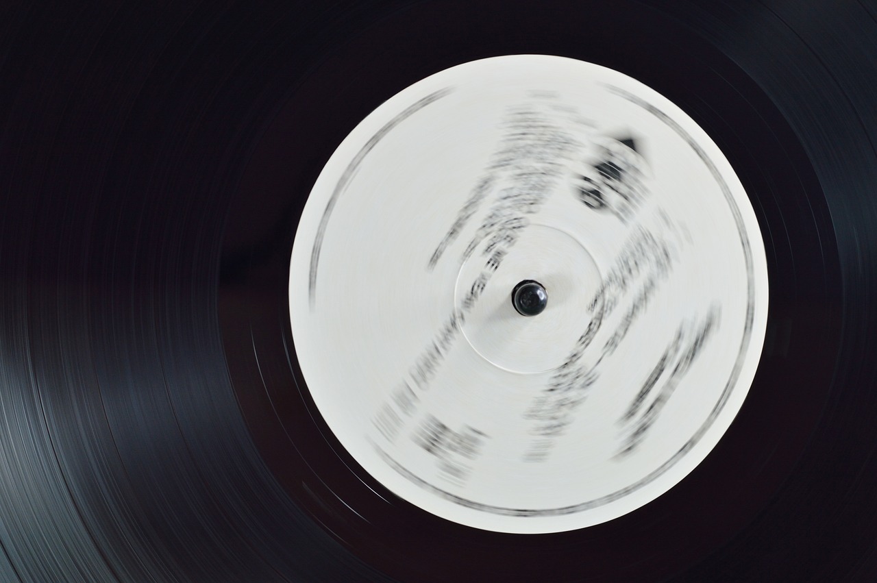
Since the vinyl era, album covers have been an integral part of music culture, and their relevance remains strong even with the shift to digital music. Iconic designs like Pink Floyd’s “The Dark Side of the Moon” or The Beatles’ “Sgt. Pepper’s Lonely Hearts Club Band” demonstrate how a compelling album cover can enhance the entire concept of the album. As someone who has spent years in graphic design, I can tell you that an album cover isn’t just an image—it’s a visual handshake between the artist and the audience. In today’s world, where streaming platforms and social media are essential brand-building channels for musicians, the impact of a captivating album cover is undeniable.
Understanding the Essential Elements of a Great Album Cover
The perfect blend that results in a striking album cover lies in valuing artist identity, creating visual appeal, aligning with the genre representation, and being mindful of your target audience.
- Artist Identity: The cover must echo the persona of the artist, which extends beyond merely mapping their visual style. Using iconic imagery that reflects their personality showcases their unique identity.
- Visual Appeal: A beautiful blend of color and typography adds intrigue to your cover design. Faces, for example, add an element that resonates with most people due to our inherent tendency to be drawn to one another.
- Genre Representation: Your cover should clearly hint at your music genre, giving listeners an idea of what to expect. Specific subtleties within your design can trigger associations with certain music genres.
- Target Audience: While designing your album cover, focus on resonating with your existing fan base and attracting potential new listeners.
Tools to Create Album Covers Online
| Tool | Free/Paid | Beginner/Advanced | Features |
| Canva | Free/Paid | Beginners | User-friendly interface, pre-made templates, drag-and-drop functionality |
| Adobe Spark | Free/Paid | Beginners | Simple design tools, integration with Adobe suite |
| Pixlr | Free | Beginners | Online photo editor with basic design tools |
| Adobe Photoshop | Paid | Advanced | Comprehensive design suite with advanced features |
| 99designs | Paid | Beginners/Advanced | Crowdsourced design platform where you can hire professional designers |
| Designhill | Paid | Beginners/Advanced | Custom design services and DIY tools |
The Step-by-Step Guide to Designing an Album Cover
- Understanding Artist Identity: It’s essential to first identify crucial words that define the artist’s identity and music style.
- Collecting Inspiration: Draw inspiration from other album covers, art, or other significant experiences.
- Choosing Colors: Create your palette with colors that align perfectly with your music’s mood and genre.
- Selecting Imagery: Choose high-resolution and relevant images that amplify the artist’s identity. Album covers should be 3000 x 3000 pixels to ensure quality on all platforms.
- Typography: Opt for fonts that are easy on the eyes but visually appealing. Remember to create a hierarchy.
- Design the Cover: Use all inputs to craft a stunning design and ensure compatibility across various formats.
- Collecting Feedback: This involves validation from multiple sources—this could even lead to essential edits.
Important Guidelines for Beginners in Album Cover Design
- Avoid clutter—simplicity rules!
- Use high-quality images and graphics.
- Stay consistent with the artist’s brand identity.
- Confirm the legibility of all text.
Principles of Good Album Cover Art
A well-designed album cover should:
- Tell a story that reflects the music.
- Be eye-catching and memorable.
- Maintain consistency with the artist’s brand and musical style.
As a graphic designer, I’ve learned that an album cover is more than just artwork; it’s a glimpse into the artist’s world. When you get it right, it can become as iconic as the music itself.
A Look at Best Practices for Album Cover Design
- Research and Inspiration: Always research and gather inspiration before committing to a design. Consider exploring the best band and musician websites for new ideas and trends.
- Originality: Aim for something unique and memorable; clichés don’t work long term. Remember, originality is key. The last thing the world needs is another album cover featuring a lone tree in a field—unless your music is about trees, in which case, carry on!
- Testing: Test your design on various devices and platforms to ensure it looks good everywhere.
- Legal Considerations: Ensure you have the rights and permissions for any images or fonts used.
The correct use of color, typography, symbolism, and imagery leads to the creation of an outstanding album cover. It’s important to select colors that evoke the right emotions, balance contrast, choose readable fonts, and use symbols to add depth and meaning.
Avoid common design mistakes such as unnecessary clutter, ignoring the audience, using low-quality assets, and opting for generic designs.
Wrap-up
Designing an album cover is an art that combines various elements to create one impactful image that conveys the music’s emotion and resonates with the audience. Designing an album cover is like composing a visual symphony—each element plays its part. So stay creative, keep experimenting until you land on the perfect design.Get started with your album cover design journey armed with these tips! Share your designs for feedback, don’t hesitate to seek help when needed, and continue improving your skills with each design. Learn more about niche edits as they can provide great opportunities for exposure and collaboration in the industry.